I attended Droidcon NYC again this year, and wrote previously about the sessions I attended on Day 1. Here is my take on Day 2:
Meetup in the Making
Chris Austin (@auzwa) spoke about the process of redesign Meetup. He stated that the company started looking at an overhaul about two years ago, after reaching a point where they couldn't iterate out of technical and design debt. Amazingly, this would be the first refresh of the service in its 14 year history.
'do better, work better' @auzwa on making the new @meetup #Android app at @DroidconNYC #design #mobile #DCNYC16 pic.twitter.com/oInKhv5kcb
— Making Meetup (@MakingMeetup) September 30, 2016
After engaging noted design agency Sagmeister & Walsh to come up with new branding, Meetup ran interviews with organizers and attendees, held offsites, and ended up with a new set of core values.
When building the new mobile apps, they used:
- React Native to build prototypes quickly
- Sketch artboards to see the entire app workflow
- a team of in-house translators working in Transifex to localize into six languages
I liked one of the closing thoughts that Chris presented us with: "apps need to feel at home in their own space". It's often a challenge to balance following Material Design guidelines with your own branding.
Efficient Android Layouts
Dan Lew (@danlew42) provided all kinds of tips for optimizing your Android layouts.
Checking out a talk by this guy, @danlew42, about Efficient Sad Puppy Layouts. #DCNYC16 pic.twitter.com/GFVfO9bKIm
— Huyen Tue Dao (@queencodemonkey) September 30, 2016
- View Groups After reviewing the pros/cons of different layouts, Dan gave a few tips for FrameLayout. In particular, they're good for overlapping views, e.g. a badge on top of an icon, and as a container for when you need to switch between two views.
- Re-use of views If you define your own custom view (e.g. a subclass of some
ViewGroup), ensure that its layout XML uses<merge>as its parent. This avoids creating an unnecessary element in the hierarchy. Big Nerd Ranch has more on this. - Styles and Themes This section was a lightning summary of the key points from a talk Dan presented last year on Using Styles and Themes. (There's also the Themes and Styles Demystified talk from I/O this year).
- Resources You can use configuration-specific resources intelligently to reduce duplication. For example, define an
isPortraitboolean undervaluesandvalues-port: now you have an easy way to check whether your phone is in portrait or not! Or, try to share a common layout, and only define includable layouts that are specific to each orientation. Similarly, if the only difference between twoTextViewsis their size, define the dimension in alternative resources, but share the same layout. - Drawables Leveraging the built-in XML drawables (shapes, layer lists, state selectors) is a lot less work than asking a designer to cut PNGs across different DPIs.
- Vector drawables Android doesn't use SVGs directly; it needs them in its own
VectorDrawableformat. Trello has open-sourced victor, a plugin to include SVGs as resources. - Tinting images You've been able to tint images in XML since Android 5.0 (API 21), but for a more general solution, use
setColorFilterwithPorterDuff.Mode.SRC_IN. More about that in Dan's own blog post. He also mentionedDrawableCompat.setTintListas another solution, especially if you want to easily create coloured state list drawables. See also Donn Felker's blog post about state list drawable colouring.
Ed. I've heard Dan speak before, and I'm always impressed by his ability to distill complex topics into the essence of the concept. One speaking technique he used was to re-cap any complex slides.
Measure, Layout, Draw, Repeat: Custom Views and ViewGroups
Huyen Tue Dao (@queencodemonkey) presented a talk on how to write custom views.
Trello peeps rocking @DroidconNYC! How Android Draws Views by @queencodemonkey pic.twitter.com/WswLPgLeYE
— Marvin Bernal (@AeroEchelon) September 30, 2016
She first pointed out that there's lots of reasons not to make a custom view: they're time-consuming, more difficult, and you lose built-in View behaviours like interaction and accessibility. From there she walked us through how Android draws.
After the view hierarchy is inflated (the XML layout is turned into Java objects), a depth-first traversal of the children is performed. Each child is passed LayoutParams constraints so that it can measure their width and height, reporting it back via setMeasuredDimension. Then, the parent decides the final size and position of each child during the layout phase, telling it via child.layout(). The parent then draws itself, and then recursively draws the children.
The easy way to get started with custom views is extending existing classes, but for performance, you could implement a fully custom view or view group. Huyen walked us step-by-step through building a tally counter as a flat (no children or use of built-in views) custom view, with a discussion of what's needed in the constructor, onDraw and onMeasure methods.
This presentation had a lot of tips and tricks, and I especially liked Huyen's personal stories about things that tripped her up when she was first starting to write custom views. The final few slides of her deck have plenty of links for further reading.
Secrets of the Support Library
Chris Banes (@chrisbanes) works on the Developer Relations team at Google, and talked about how recent features in the support library were built.
After a discussion of the DayNight theme, Chris moved on to some flinging issues with AppBarLayout. He talked about how to resolve the bugs, but the details were over my head!
Next, he turned to the intricacies of nested scrolling. In all honesty, I couldn't follow everything he talked about, but it was interesting to hear about the challenges the team faced in trying to fix the bugs.
Ed. His slide deck used a dark theme that made all of the screenshots and code snippets really stand out. I especially liked the use of colour to link elements in XML layouts to their rendered views.
Mastering Material Motion
Mike Wolfson (@mikewolfson) emphasized the importance of thinking about motion in your apps, to provide that extra level of polish.
Google published a set of guidelines for motion this year. Mike walked us through the four principles of motion in Material Design.
- Responsive Apps should respect and reinforce the user as the driver of motion. Put another way, things on screen should rarely move on their own. Two places where motion is used when a user taps are ripple effects on clickable views, and elevation changing.
- Movement is informed by real world forces, so it should feel natural. Keep animation durations short, and tuned to screen sizes: tablets need longer durations, and wearables need shorter ones, relative to phones. The guidelines have specific easing curves to use for when an object is moving between two points on screen, when it is entering the screen, and when it is leaving. The Interpolator Playground can be used to try out different curves.
- Material is aware of surroundings (user and objects). For example, setting
animateLayoutChangeson aViewGroupgives you animations when children appear or disappear. Notifying aRecyclerViewadapter as precisely as possible as to the changes in the data set, results in animations of items that are added or removed. - Finally, motion should be intentional, guiding the user's focus to the right spot at the right time. A prime example of this is shared element transitions, but avoid animating more than two elements at a time, or animating elements in different directions.
Delighting Details - Animated Vector Drawables
Marcos Paul Damasceno (@marcospaulosd) spoke about animated vector drawables. He began with an overview of Android's support for vector graphics (beginning in Lollipop) and also an overview of how they compare to SVG. Animation of vector drawables arrived in Lollipop, and has been backported to Version 23.2.0 of the Support Library.
There are a number of properties on vector drawables that can be animated using ObjectAnimator or ViewPropertyAnimator. These include the path data (the line and curve drawing instructions), and attributes on the trim path (the start/end positions of the stroke used to draw the line segments). Marcos actually did a live demo of creating an animated drawable.
When working with SVGs on Android, a utility called svg2android is useful to convert them into VectorDrawables. victor (mentioned above) uses this under the hood. And if you're working with path animations, you need to ensure the two vectors have matching line drawing commands. I've played with vectalign which is a clever tool to automatically align two SVGs.
Getting caught up on animated vector drawables courtesy of @marcospaulosd pic.twitter.com/gYwDaHPhFB
— Ben Oberkfell (@benlikestocode) September 30, 2016
Marcos also gave a great tip about using a bundle to replace the minimum of three files you typically need when creating animated drawables: the VectorDrawable itself, Animator(s) to run on it, and the <animated-vector> definition. More info on bundles in this post from Mark Allison, and his series on vector drawables is here.
Animatable - Beautiful Meaningful Animations
Nick Butcher (@crafty) gave a stunning presentation on advanced animations. This follows on his talk, Building Meaningful Motion, presented at Droidcon UK 2015.
Excited to grab front row seats to @crafty's talk "Animatable", a deep look into Motion Design. #DCNYC16 pic.twitter.com/dM14cb7L9g
— Huyen Tue Dao (@queencodemonkey) September 30, 2016
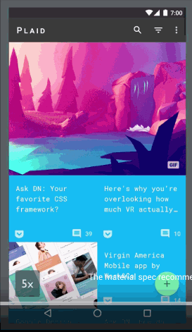
For this talk, he used examples from Plaid, a demo app he wrote to showcase Material Design.
The first thing he dove into was Surface Manipulation, in particular, his implementation of a bottom sheet. I think the Design Support Library didn't include this when he wrote this app, or perhaps this implementation made its way into that library. His hints included using onTouchEvent to get the Δy value, offsetTopAndBottom to position the view (to avoid a layout pass) and using ViewDragHelper. The use of nested scroll events allows a single gesture to expand the bottom sheet, and then begin scrolling the nested view.
Next, he turned to a very dazzling demo of an advanced text transition:
Android provides ChangeImageTransform and ChangeBounds to easily create shared element transitions on images. But text is trickier, since you have to deal with truncation, word wrapping, etc. Nick walked us step-by-step through his solution:
- Record the start and end states of the two text views with respect to characters, size, bounds (because of wrapping), colour, line spacing, and number of lines. Call this a
StaticLayout. - Examine each text view character by character, to build up a list of "runs", sequences of words that don't break between the two views.
- Capture a bitmap for each run. We don't want to transition text by animating the font size, as that would be highly detrimental to performance, as the cache where font glyphs are kept would be constantly invalidated.
- Scaling bitmaps, though, introduces pixelation. In addition, fonts have different kerning rules at different sizes. To somewhat hide any jarring transition, switch between the two bitmaps in the middle, rather than at the beginning or end, where it would be more visible.
- To animate the bounds difference, temporarily disable children clipping, so children can draw outside of their parent.
- The different runs may end up crossing each other as they are animated. To avoid this, if the final position switches to the opposite side, define a curved path with a bit of delay (to allow runs that move in a straight line to move first), but time it so that all words will arrive at the same time.
Some additional learnings and tips that Nick shared:
- The timing or choreography of element transitions can draw attention to them. He described staggered start and staggered distance techniques for animating list rows appearing. Delaying the entrance of a FAB and making it "pop" also draws your eye to it.
- Animated icons require that the vector path data line up. Designers should consider the order that they draw lines in, to ensure they are rendered correctly. (Mark Allison discusses this in a post about fill windings.)
- When animating a line being drawn over an icon, use a clip mask to block out the part you're going to draw over. This avoids problems with overlapping alpha.
- Roman Nurik is developing an Android icon animator tool
- Make use of quick settings tiles to easily change animation and transition durations
Close the Loop: Designing and Developing Together
Kristin Marsicano (@kristinmars) and Zack Simon (@zackiets) did a joint presentation about how designers and developers can work better together.
Another example! :-) @zackiets pic.twitter.com/S9N8FpFLGN
— Kristin V Marsicano (@kristinmars) October 3, 2016
The process they use at Big Nerd Ranch begins with a kickoff where everyone comes together to clearly identify each person's responsibilities, the tools, and the schedule. Since everyone can't dive in right away, a discovery period is needed for designers to do user research and for developers to study APIs and existing implementations. During this period, it helps to establish a shared language for screens/items/objects to streamline communication.
Without completed designs, there are still plenty of chores that both designers and developers can do, e.g. setting up continuous integration, getting enrolled for external APIs, building a style guide, etc.
After a round of implementation, during the review period, there is a period of "annealing", a back-and-forth process between design and development to settle on the final implementation. And when a sprint is completed, a retrospective can be used to discuss what was good or bad about that sprint's process, and adjust for future sprints. This allows the whole team to own the success of the project.
Information about user stories should be kept as close as possible to the story, by using the built-in commenting system, say, in InVision or GitHub. Stories should define clear preconditions and steps, and have clear acceptance criteria. Designers should be instrumental in writing stories, since they have all the context of the app from the wireframes they've created.
For successful implementation, it helps to have a shared language between designers and developers. Applying the Atomic Design principles to Android, atoms such as colour names should be defined in colors.xml using the same names as what the designer has described in the style guide. Type styles should be defined in a TextAppearance style in styles.xml A molecule such as an EditText input field should also be defined as a style, and its text appearance should reference the atom defining a type style.
When things aren't working, teams should be responsive, not reactive. Step back and think about facts, and don't react with your gut. Kristin and Zack encouraged us to be more empathetic, to check our egos, and to assume positive intent.
Final Thoughts
Thumbs up again for this year's instalment of Droidcon NYC. My only critique is that I couldn't attend more of the talks in person, although the videos should be available publicly soon.
Read my thoughts on Day 1 here.
